One of the most favourite Czech spirit brand introduces its new product label
We are proud we could participate in development and production of the new design.
Žufánek is a brand of spirits well known and beloved in the Czech Republic. The design of the fruit brandies and liqueurs had not changed significantly from their initial simplicity: an abstracted illustration of the fruit, the name of the product in a handmade ‘woodcut’ font and the name of the brand.
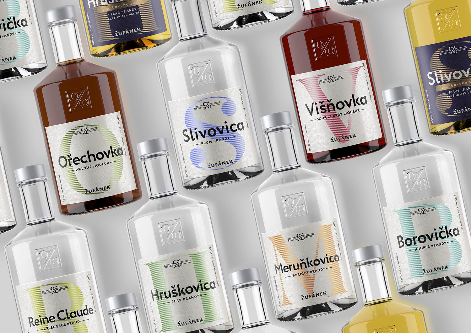
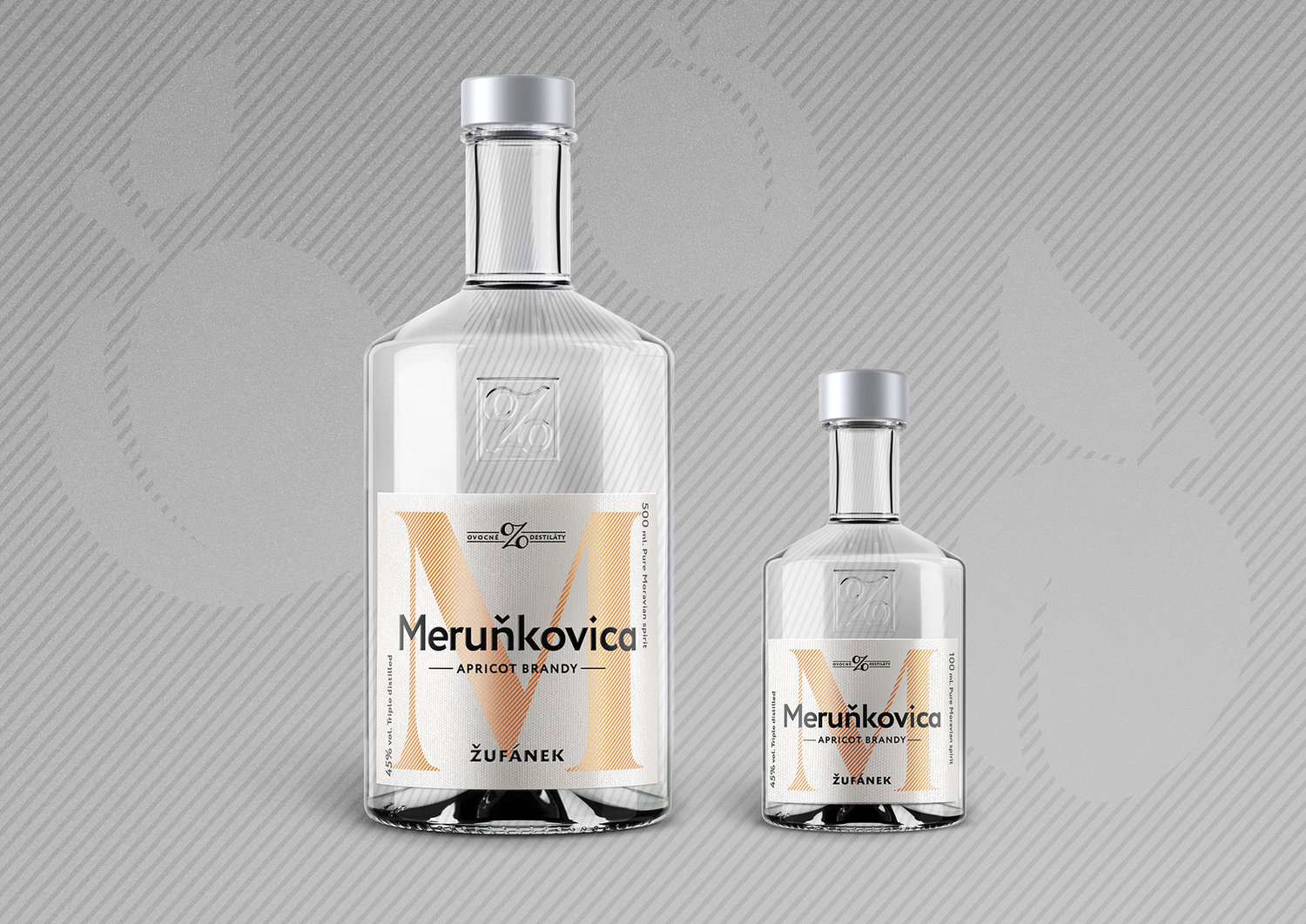
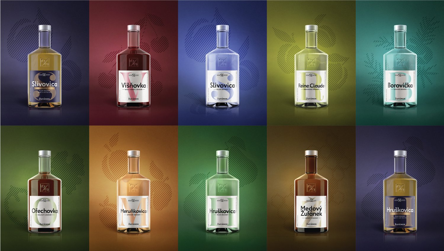
The new labels are therefore a more modern, more premium version of the same idea of abstraction. But this time we are taking it even further, so the signifier for each flavor becomes the initial of the product name instead of the illustration of the fruit, therefore creating a new alphabet of alcohol.
Learn more about redesigning: